Context
- A family in Cartagena had owned land on Tierra Bomba for years, leasing it to others. They finally decided to build something of their own, something that would serve the island community, not just extract from it. Nico came on as sole creative lead: strategy, naming, identity, everything.
Challenge
Tierra Bomba is crowded with beach clubs competing for tourist attention. Most look the same and operate the same. Mai Ri needed to feel different from day one, rooted in the island instead of just sitting on it.
The Name
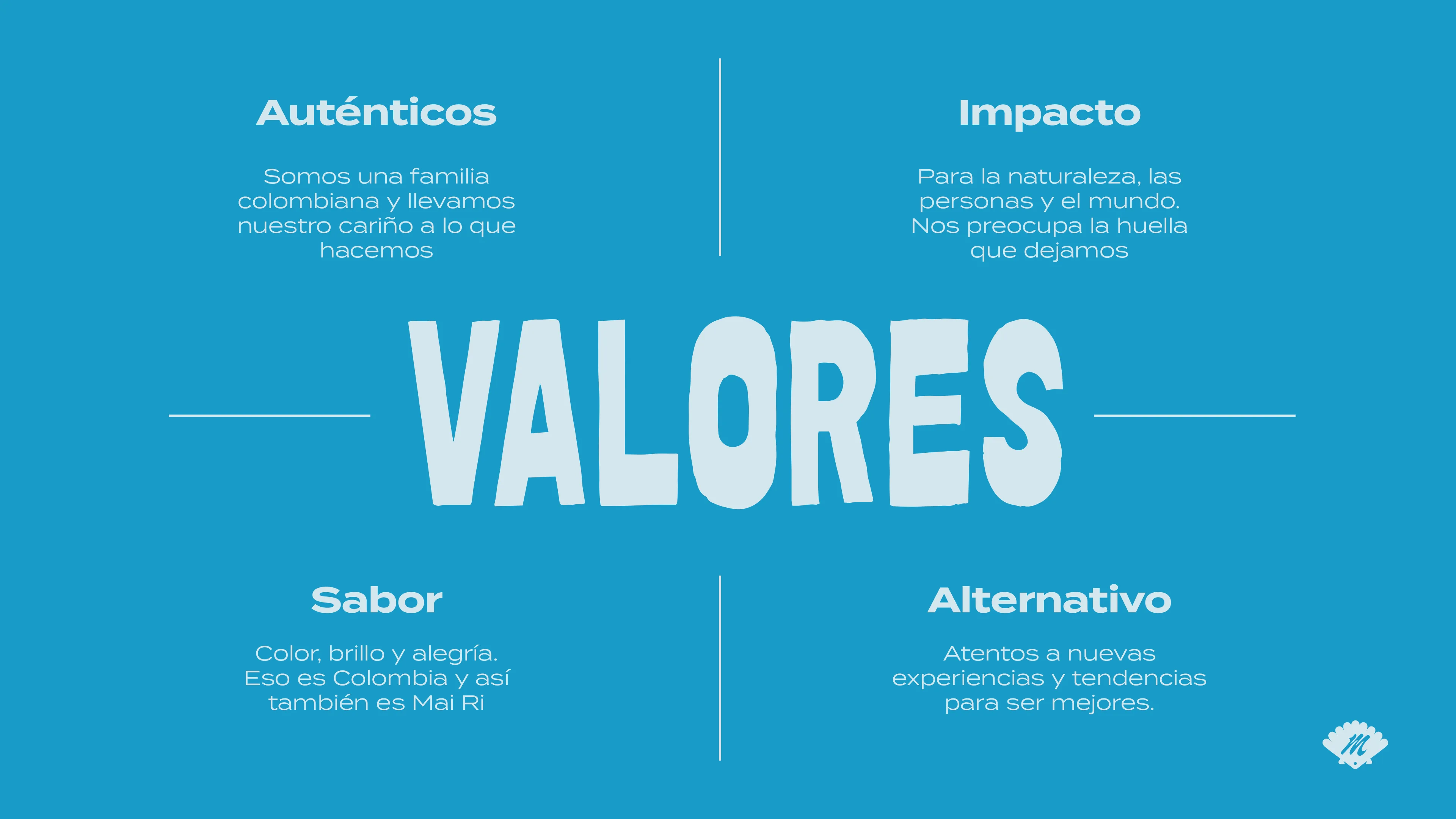
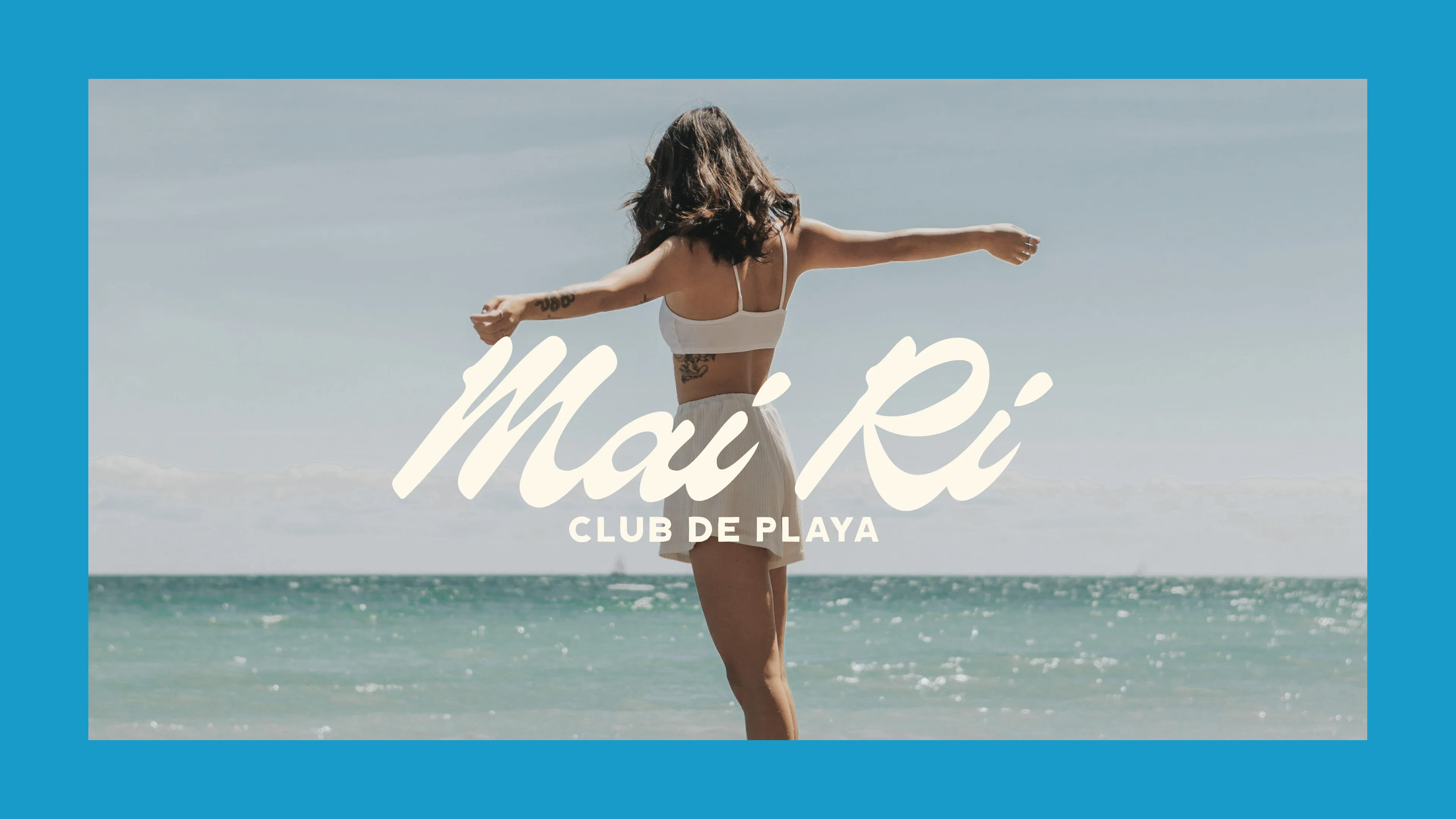
Tierra Bomba is an island with layers of history. Fought over by Spaniards, indigenous peoples, libertadores, and even pirates. Full of stories, myths, and flavors, and now a meeting point for tourists and locals. Mai Ri is born from respect for that territory, the water, and the people. A beach club to have a good time and do good.

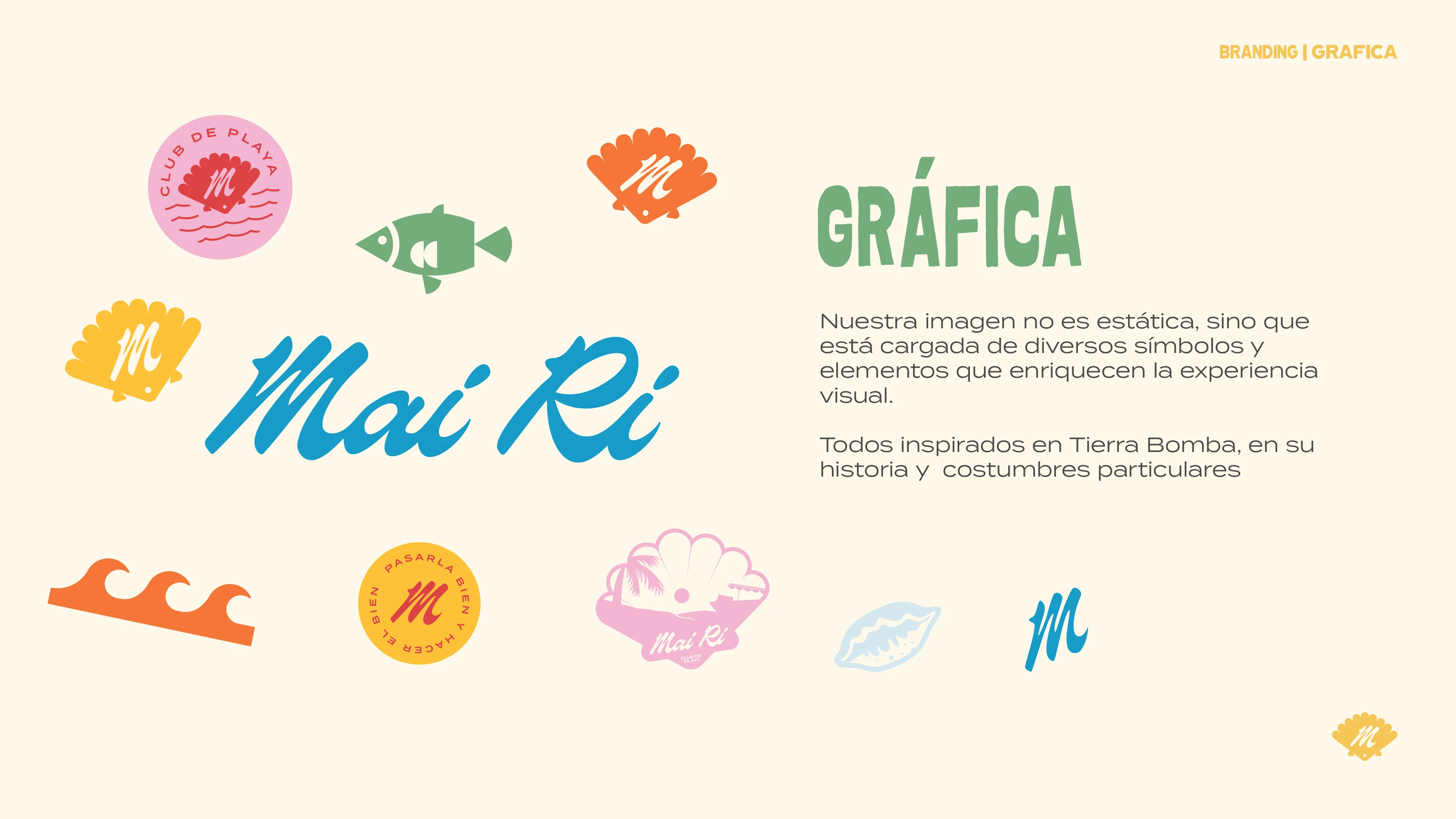
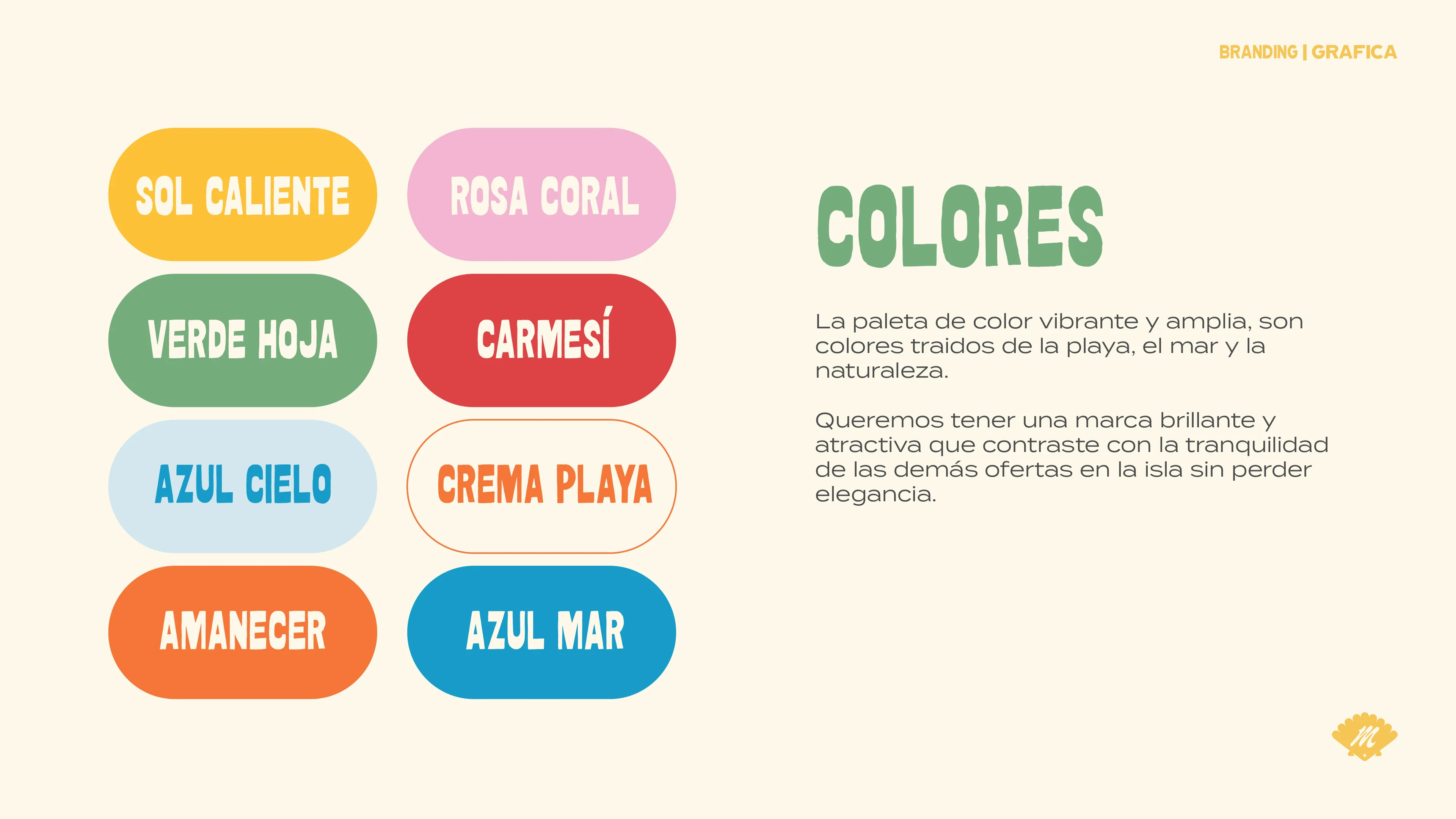
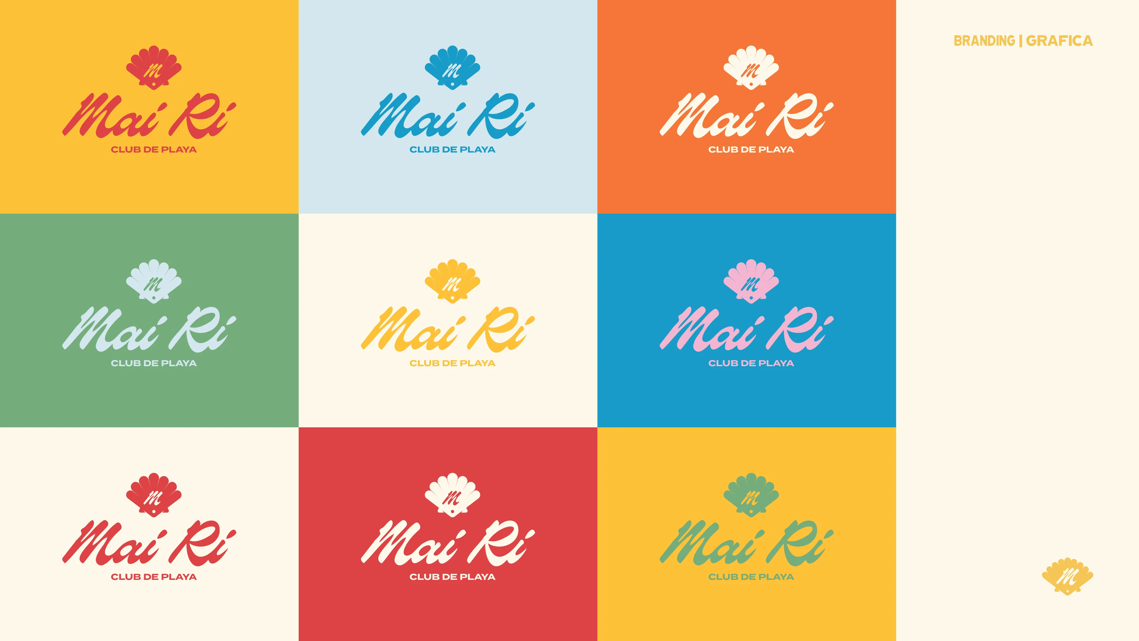
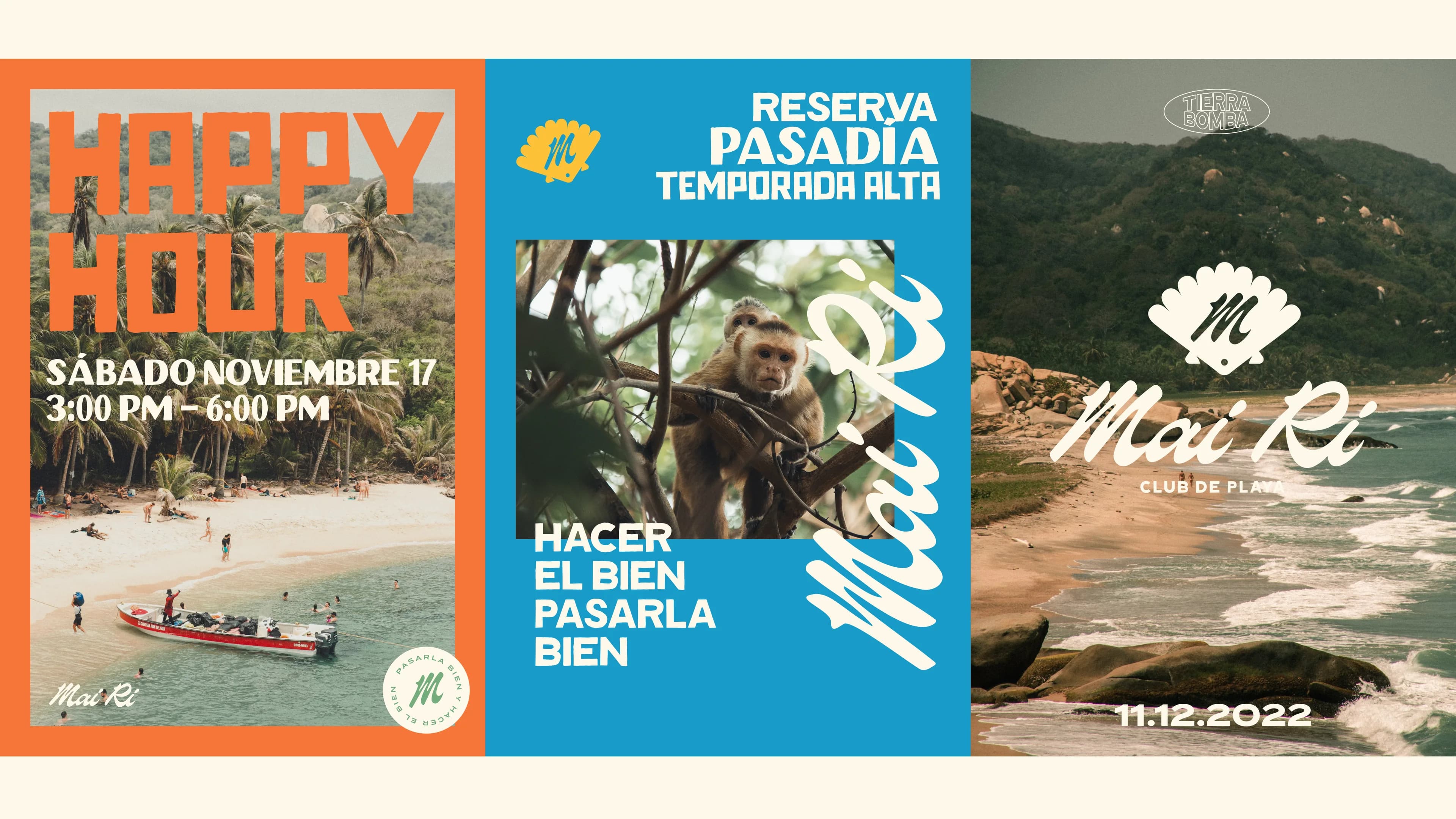
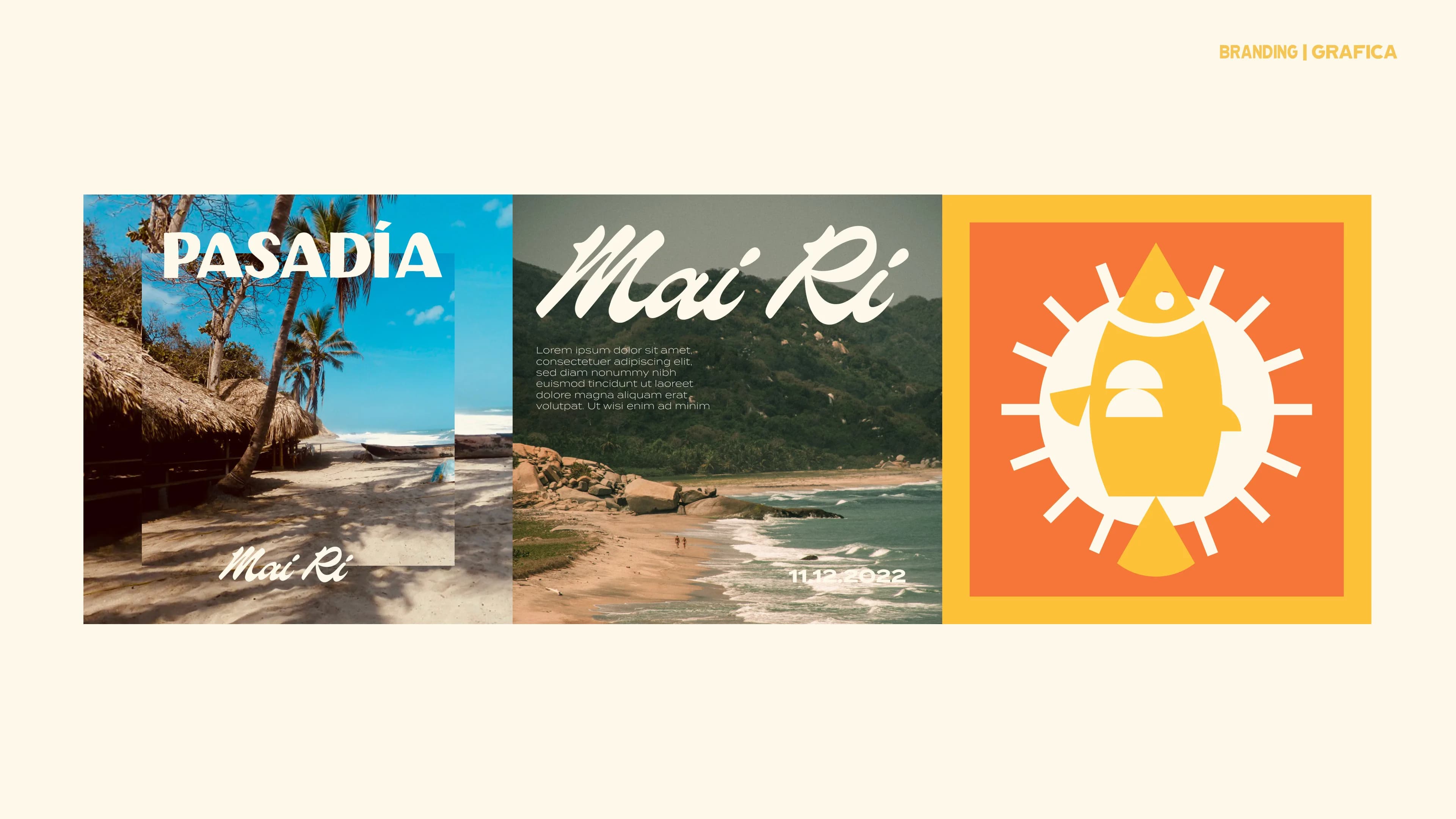
Visual Identity
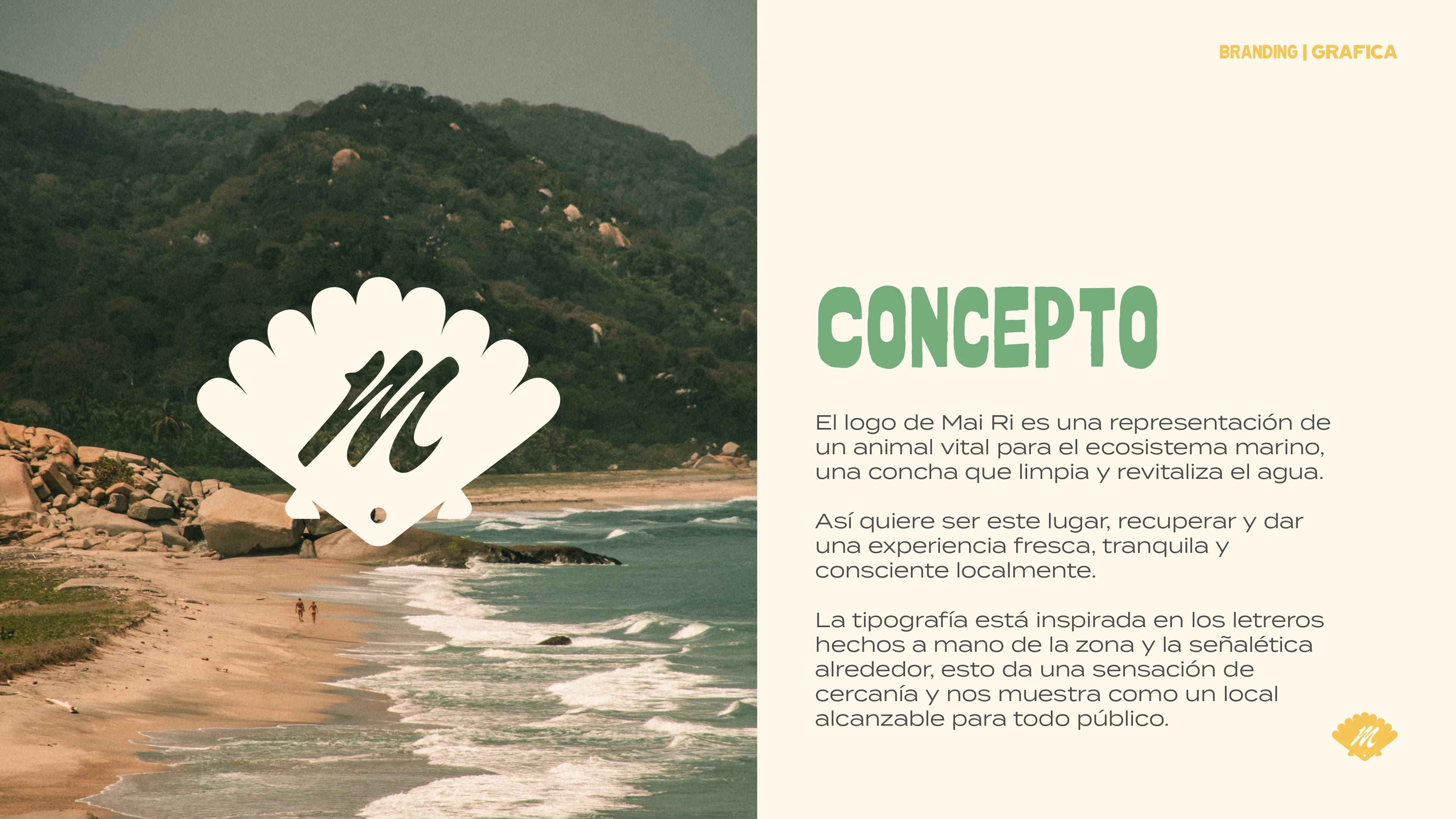
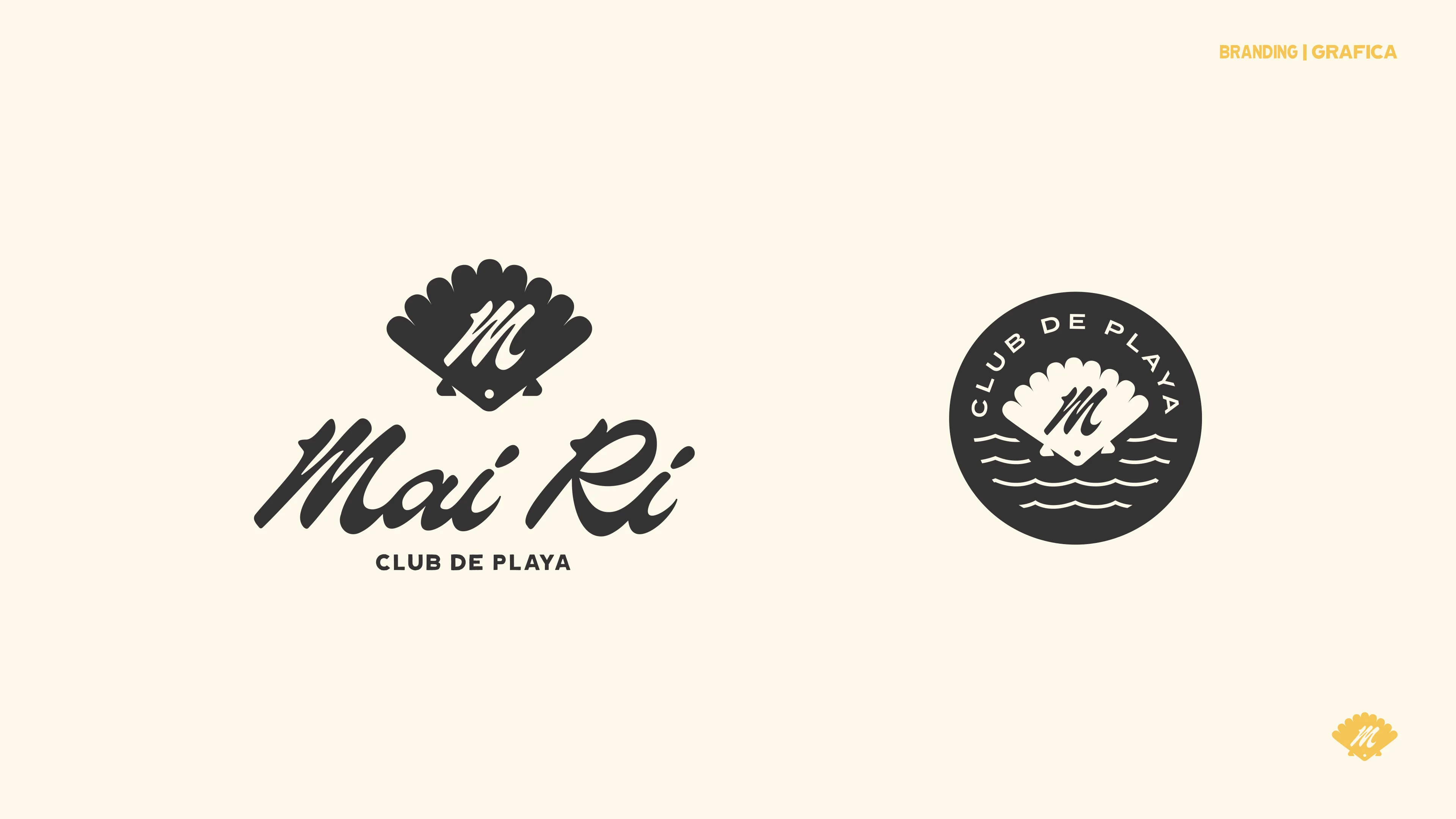
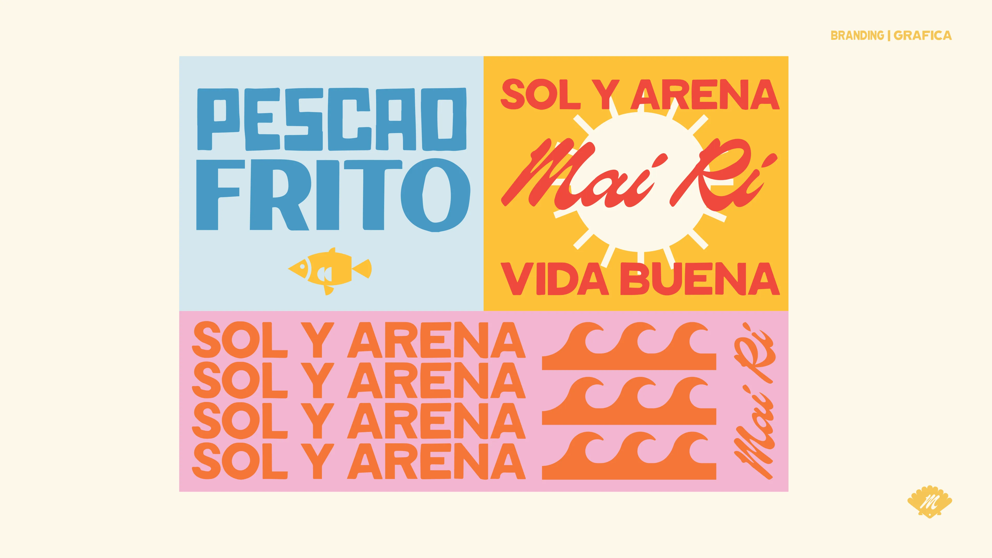
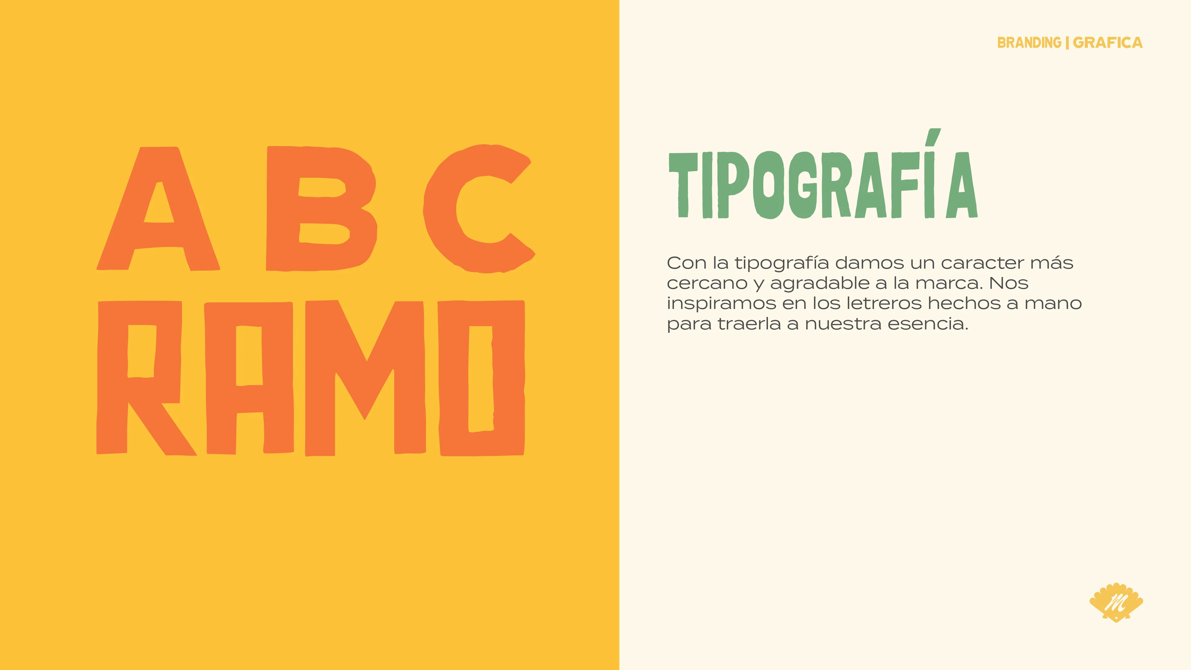
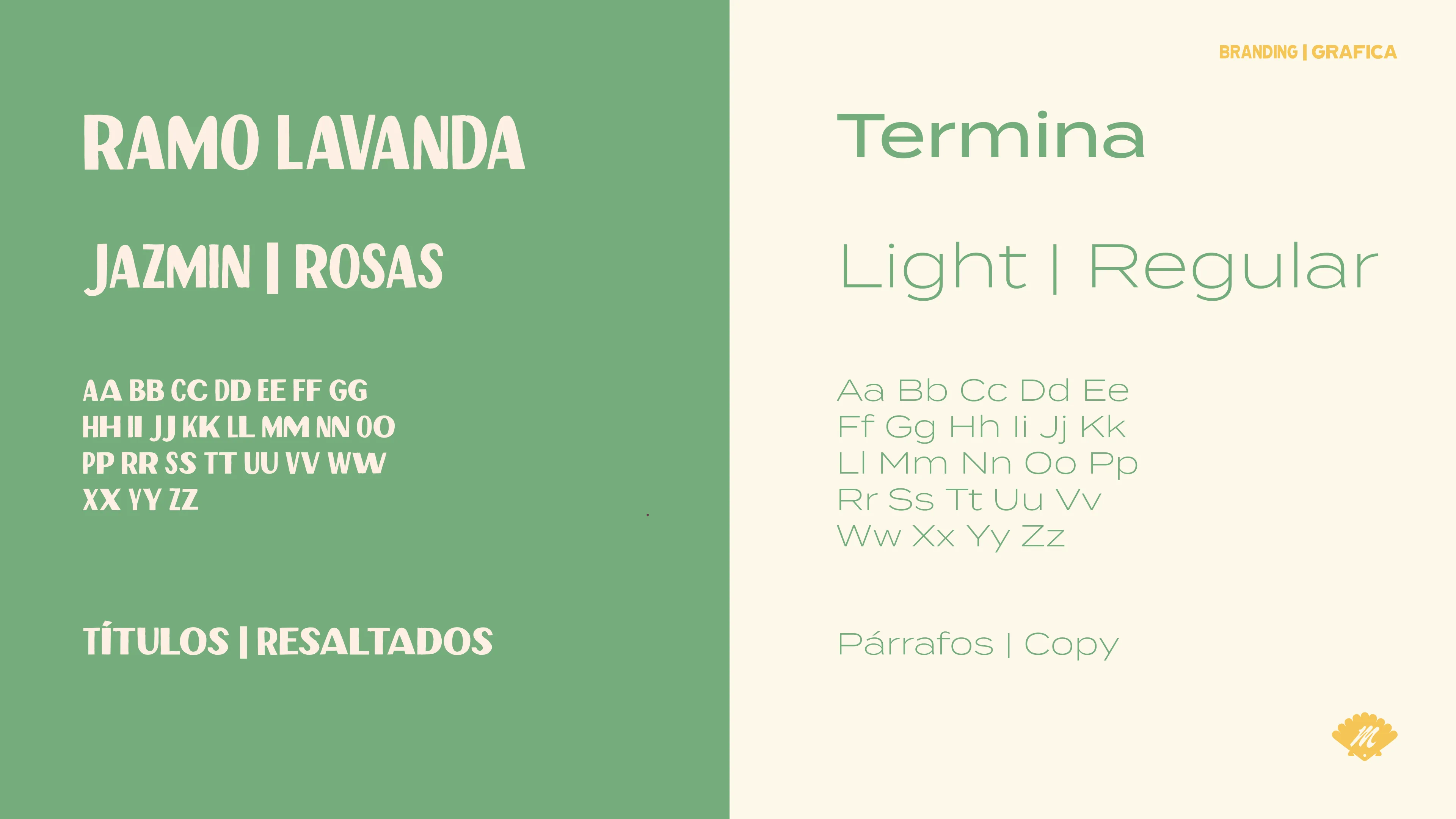
The logo represents a seashell, an animal vital to the marine ecosystem that cleans and revitalizes the water. Just like the place itself: recover, refresh, and be locally conscious. The typography is inspired by the hand-painted signs found around the island, giving a feeling of closeness and making the brand feel approachable.
Brand Applications
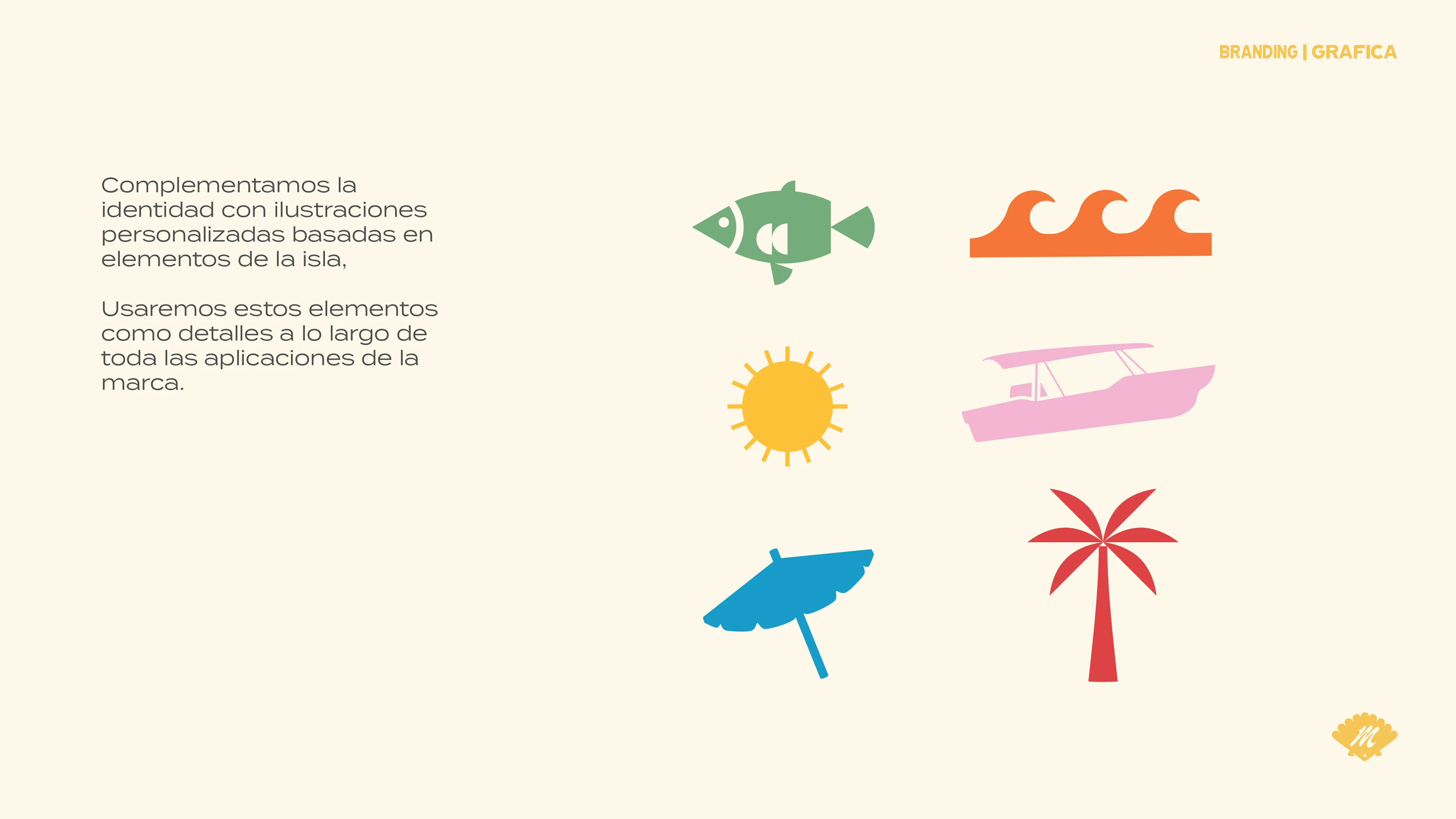
The visual system comes alive across social media, event promotions, signage, and merch. All inspired by Tierra Bomba's history and local customs. Every element is designed as a detail that enriches the brand experience on and off the island.
Impact
Mai Ri launched with day passes and quickly grew into hospitality nights. It gained real terrain in Tierra Bomba's competitive market by hiring local people, promoting conscious beach practices (no littering, local food, fair prices), and becoming a genuine part of the community. By 2026 the family moved on and handed the project to someone who could carry the idea and the community forward.