Context
2023, Bogota. A group of friends wanted to open a taqueria but not just another Mexican restaurant. They wanted something with personality, something loud, fun, and a little over the top. The kind of place you remember not just for the food but for how it made you feel. Nico came on to build the entire brand from scratch: strategy, naming, visual identity, illustration, and every touchpoint from menus to takeout boxes.
The Name
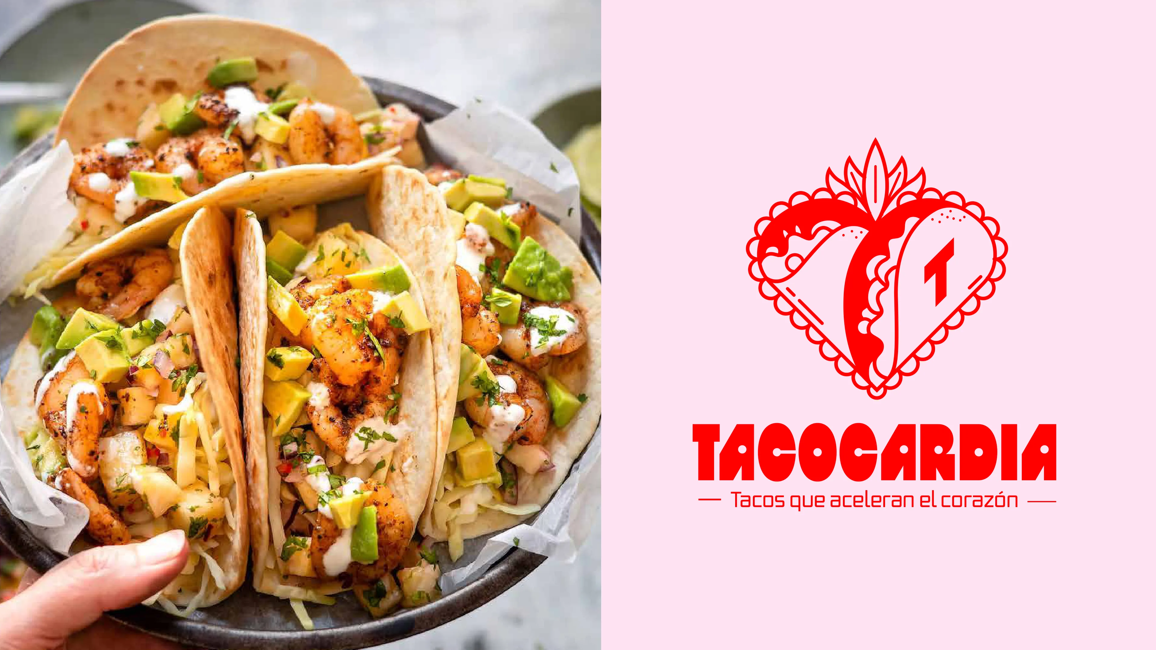
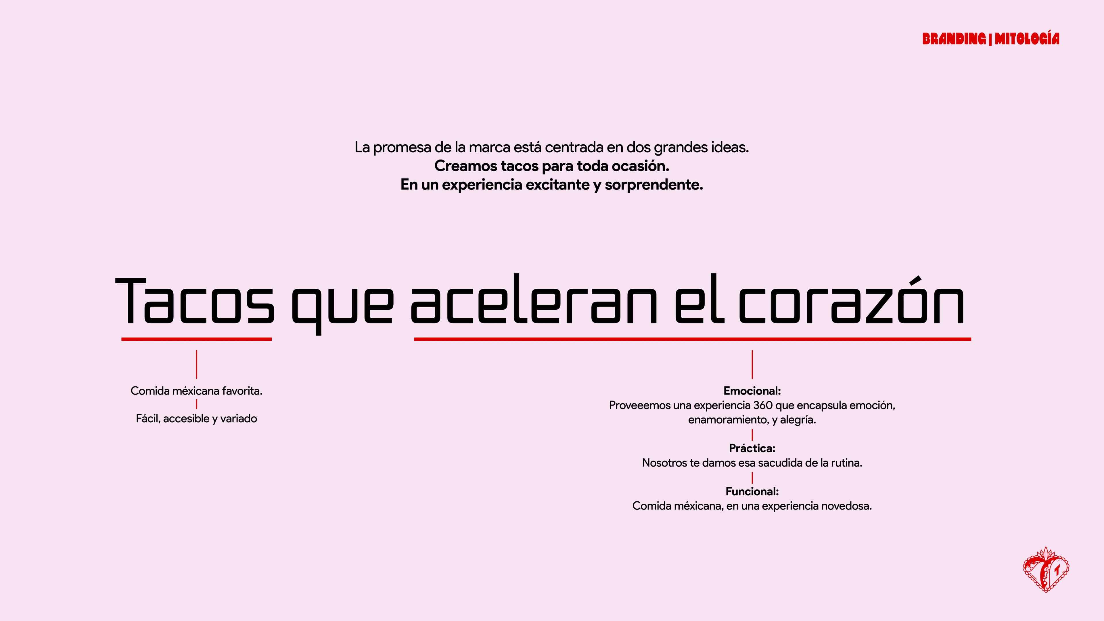
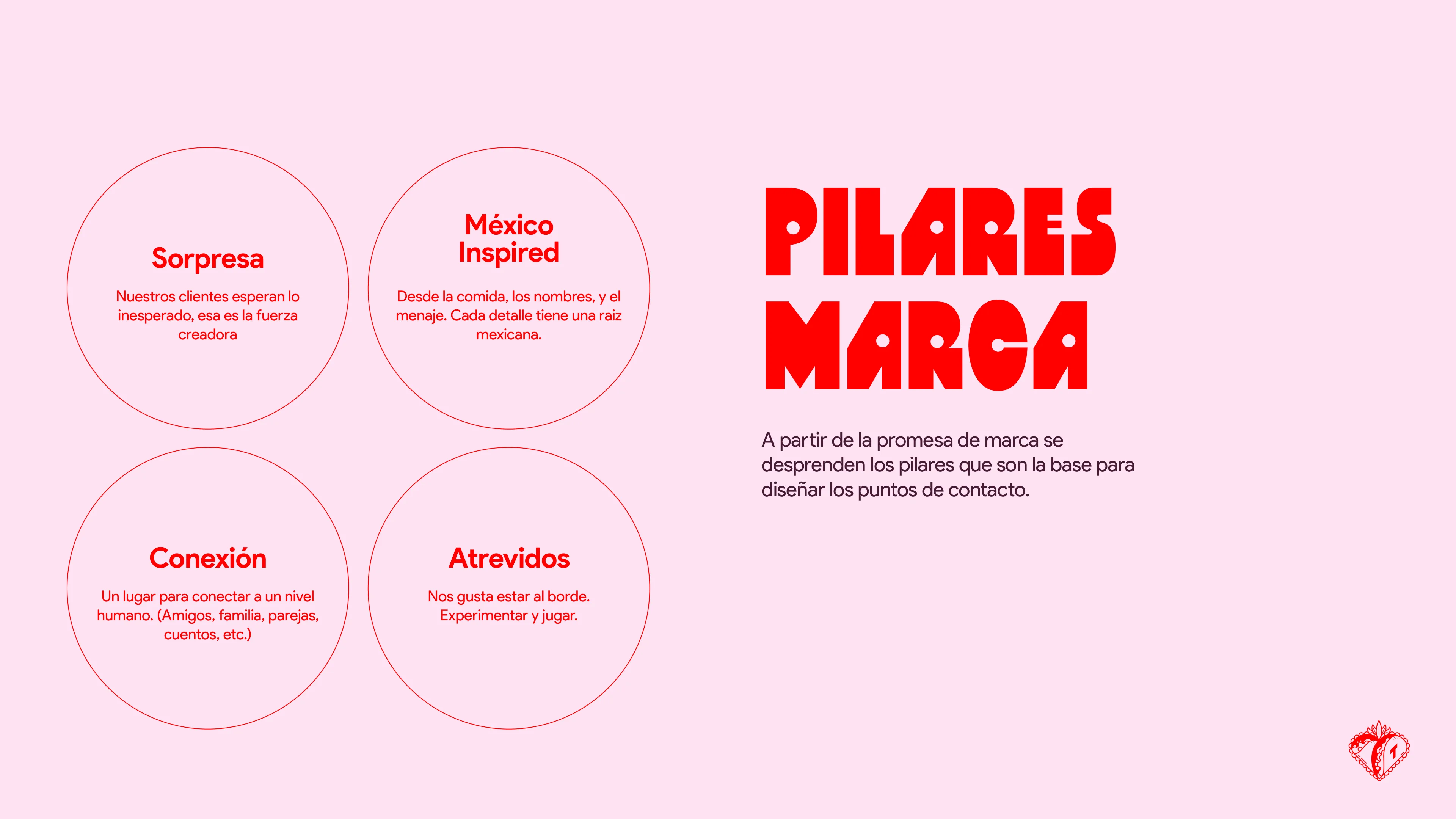
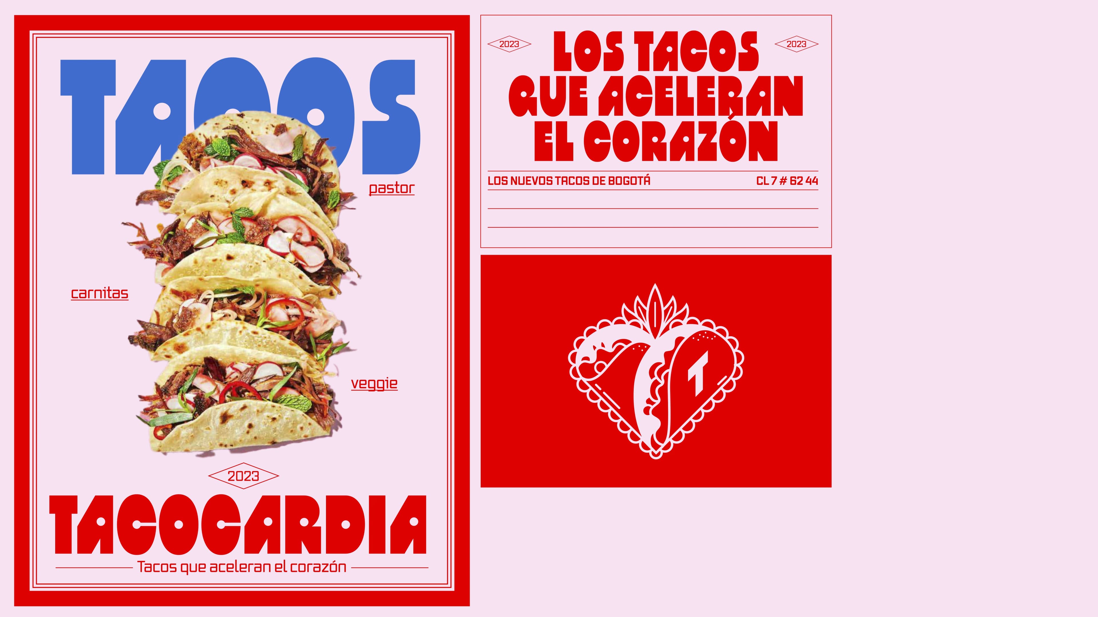
Tacocardia. A wordplay between "taco" and "taquicardia" (the heart racing condition). The tagline followed naturally: "Tacos que aceleran el corazon." The whole brand promise sits on two ideas: we make tacos for every occasion, and we turn it into an experience that surprises you. Emotional, practical, and functional at the same time.
Visual Identity
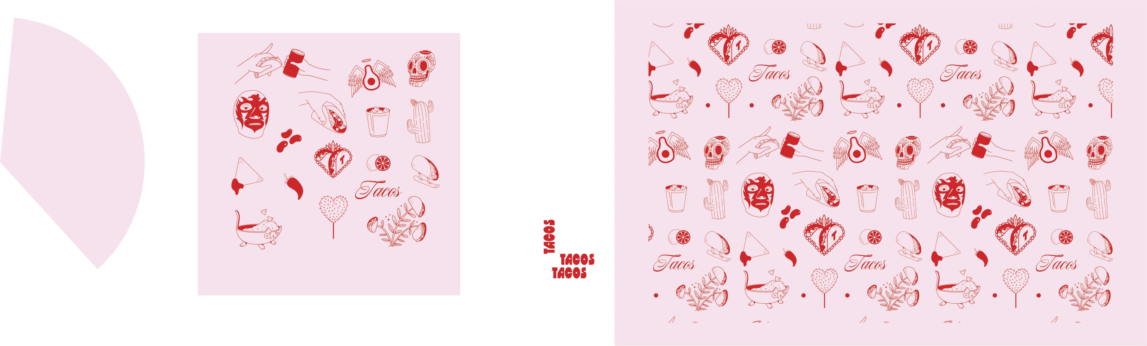
The logo is a sacred heart with a taco inside and a "T" on the other half. It references Mexican folk art (corazones sagrados) while keeping the playfulness of the brand. The color palette is bold: red and pink as the base, with navy blue for contrast. Every detail leans into Mexican culture without being a cliche. Three typefaces split the work: Salta BT for display, Vox Medium for titles, Product Sans for body text.
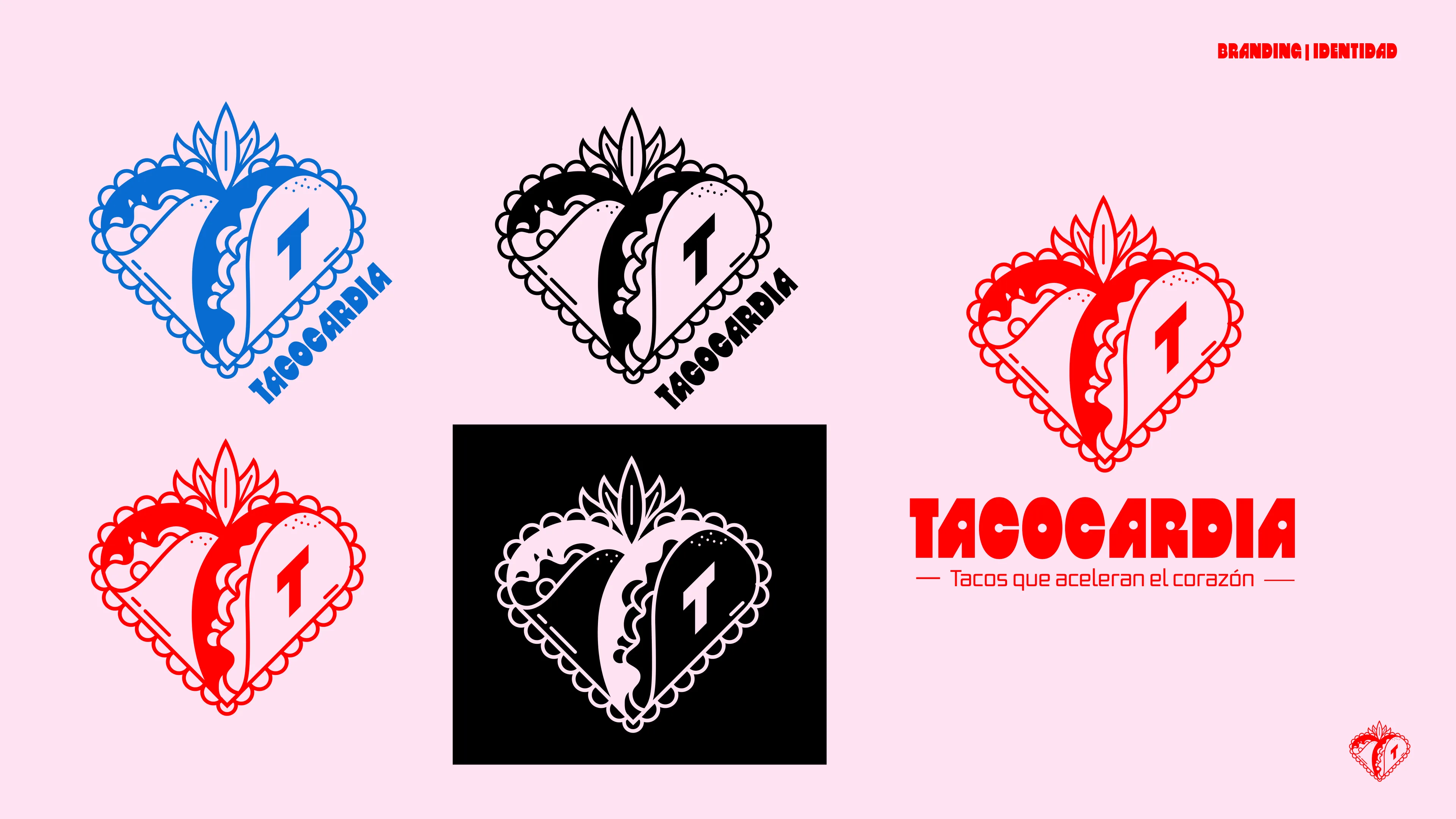
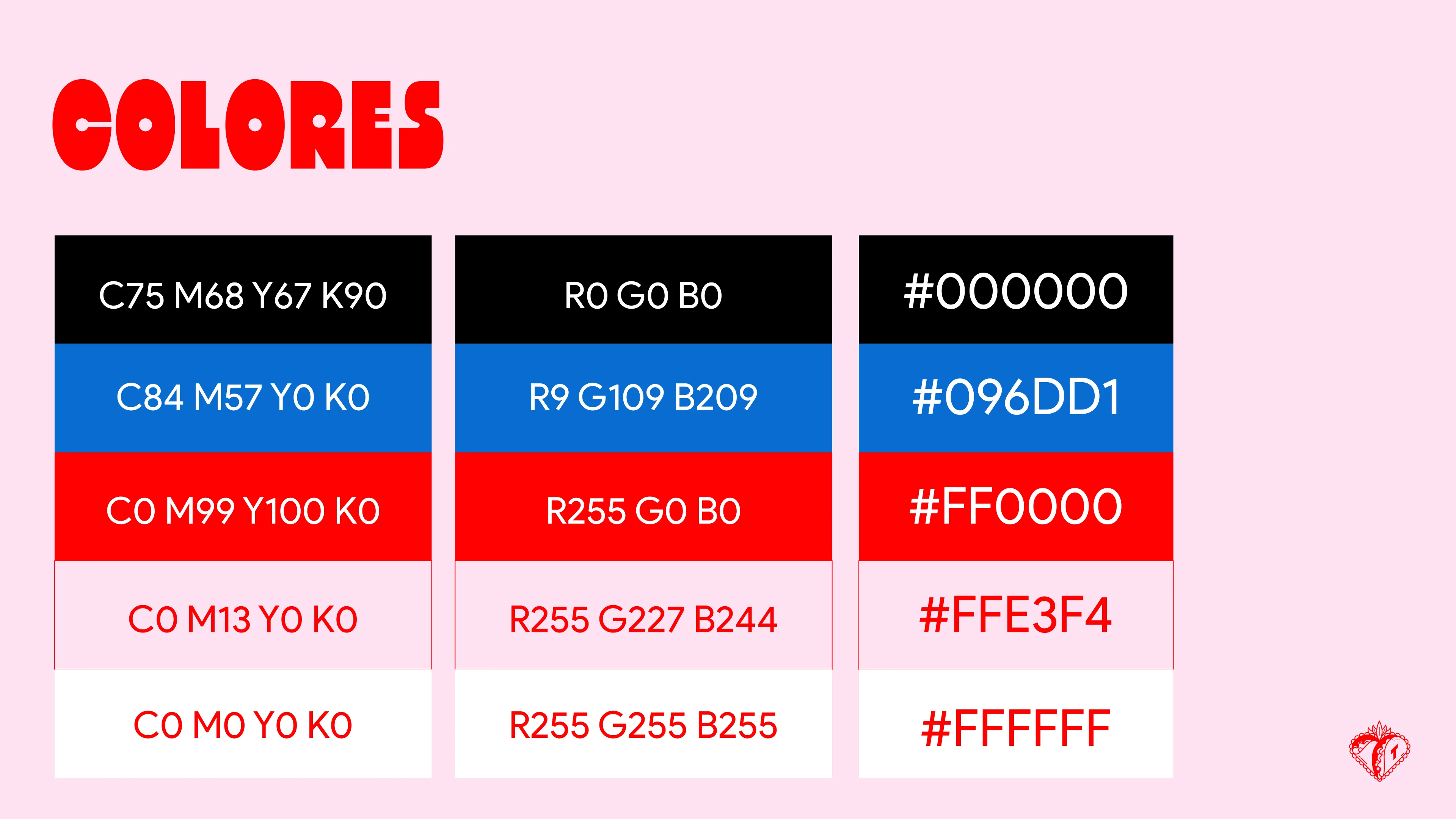
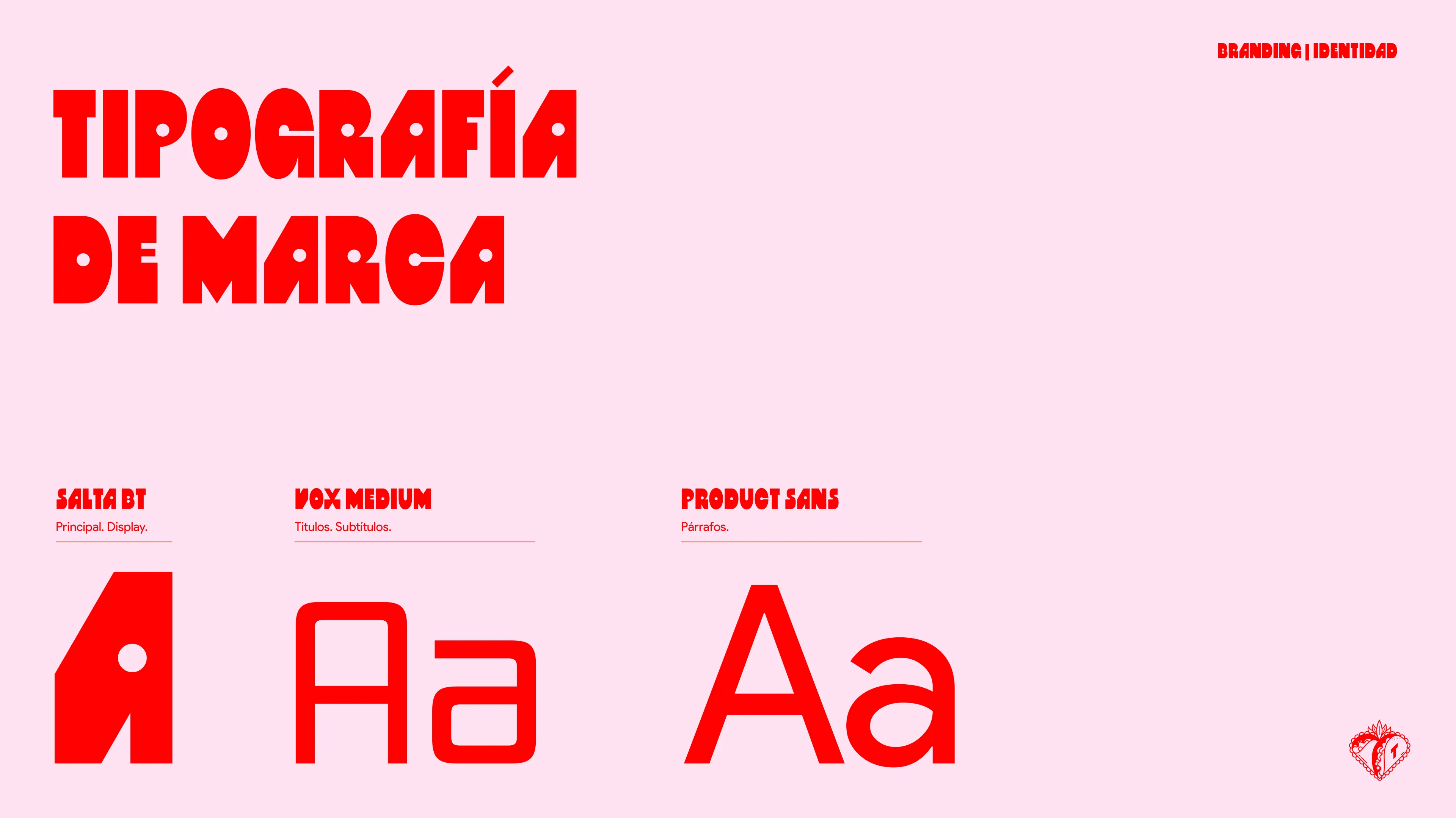
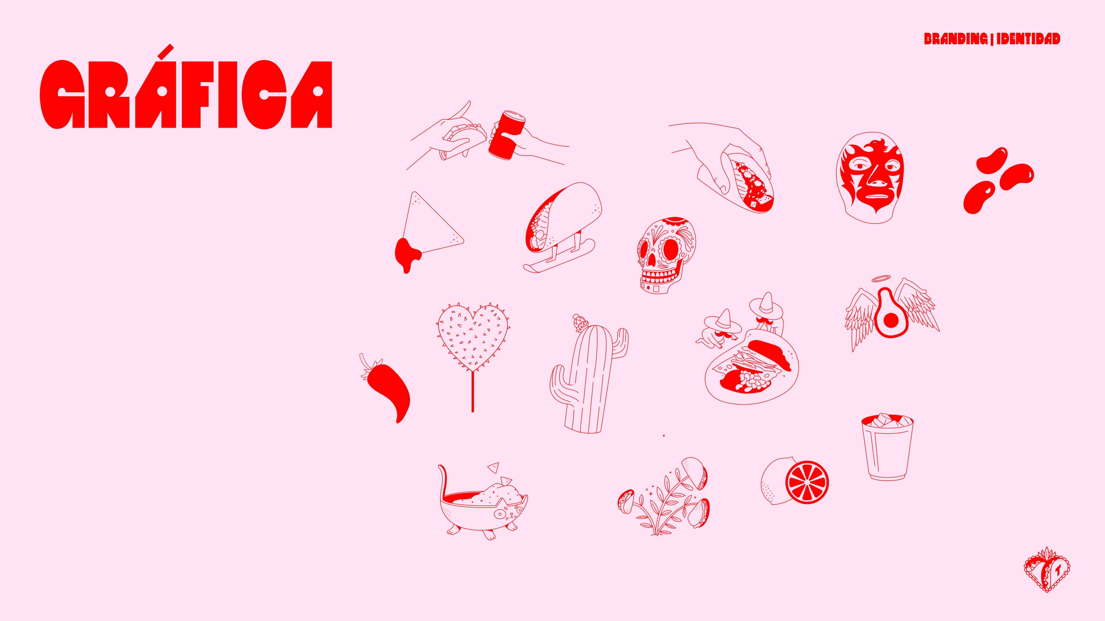
Illustration System
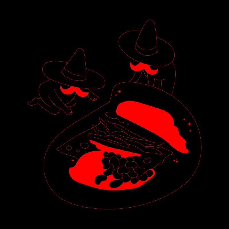
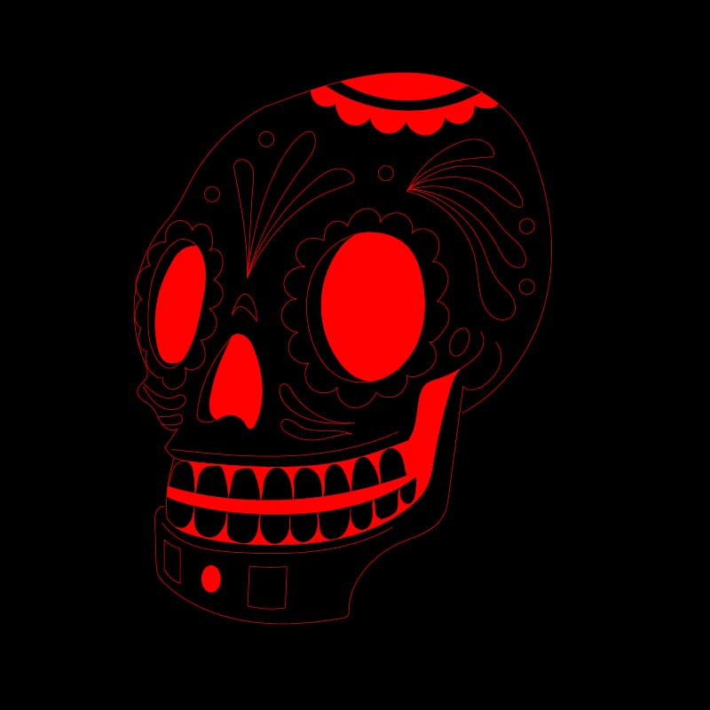
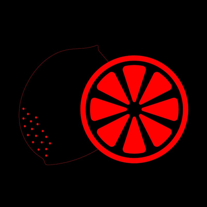
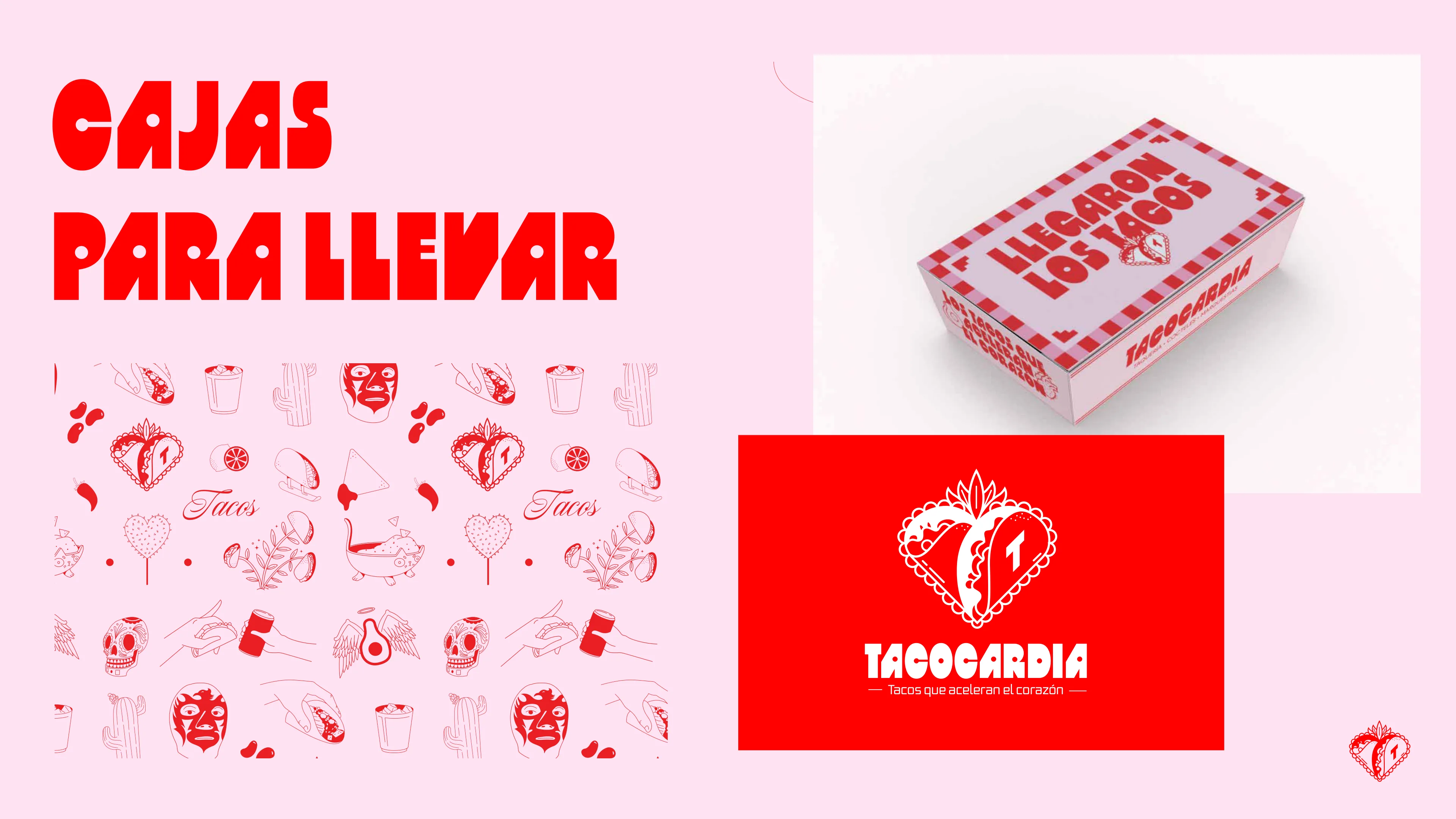
A full set of custom illustrations was designed to support the brand across all touchpoints. Skulls, cacti, luchadores, avocados with wings, limes, mezcal glasses, hands holding tacos. All drawn in a red line-art style on pink backgrounds. These illustrations come together in a repeating pattern used on packaging, wrapping paper, and merch.

Brand Applications
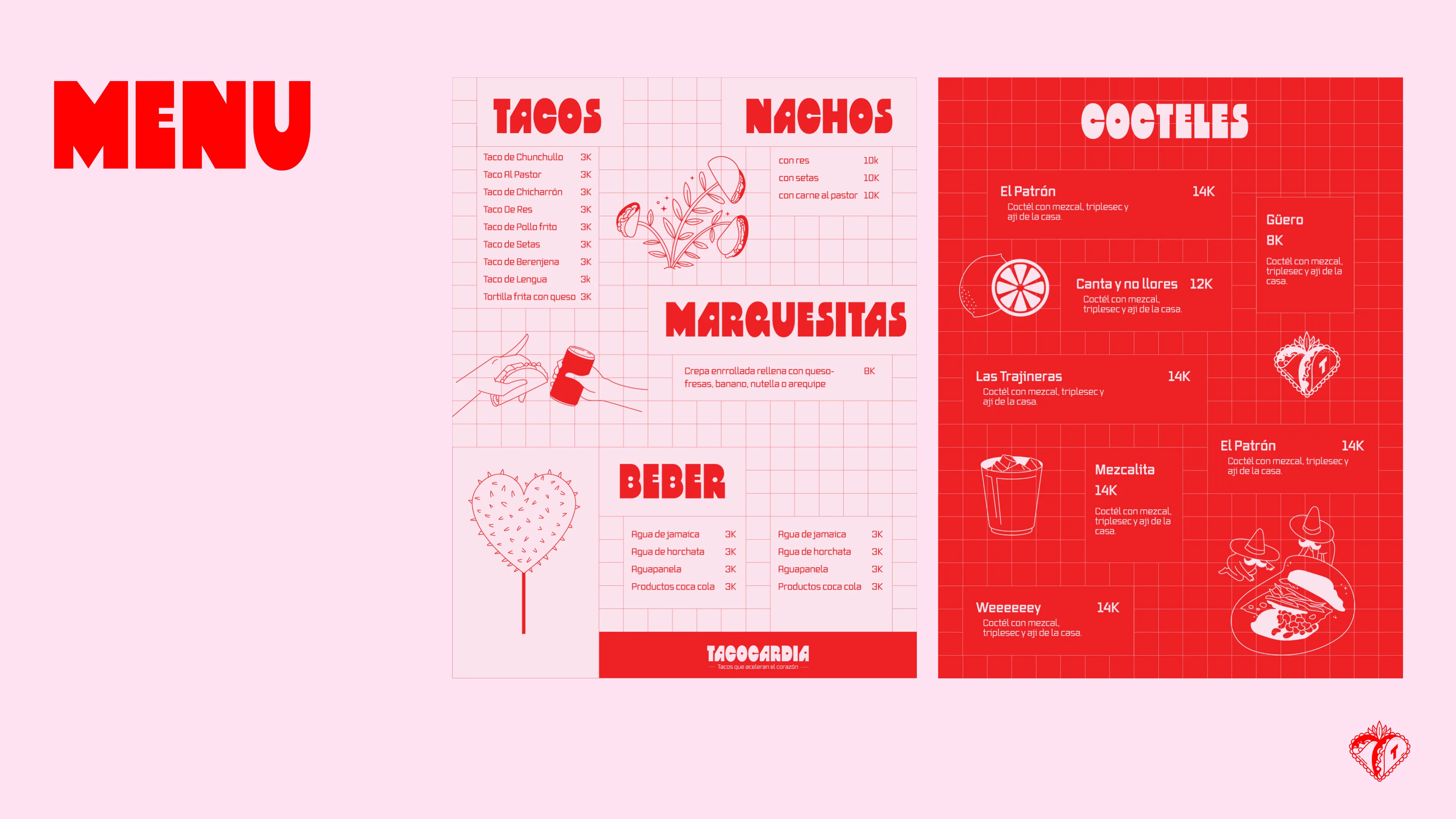
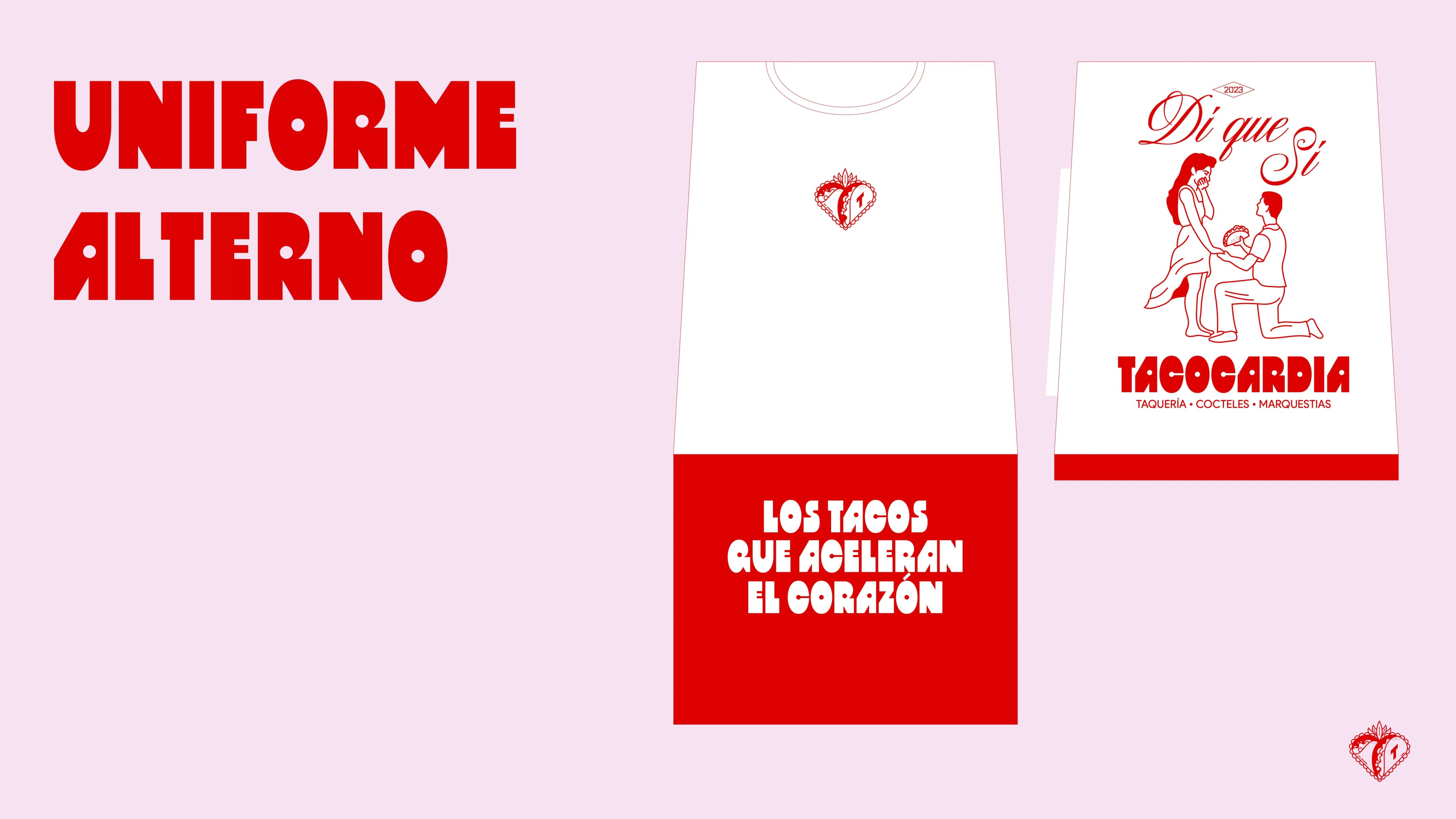
The identity system covers everything a restaurant needs to feel consistent: printed menus, promotional posters, takeout boxes with custom phrases ("Llegaron los tacos"), staff uniforms inspired by Mexican and ranchero aesthetics, and t-shirts. Every piece reinforces the same tone: bold, warm, and a little irreverent.
Impact
Tacocardia opened in 2023 and quickly built a following in Bogota. What started as a single location has expanded into more spots and even a mobile taco truck, always maintaining the same identity. The brand system was designed to scale, and it did. Menus grew, new locations needed signage, the truck needed wrapping, but the core stayed consistent. It is a genuine entrepreneurship story that keeps going.